

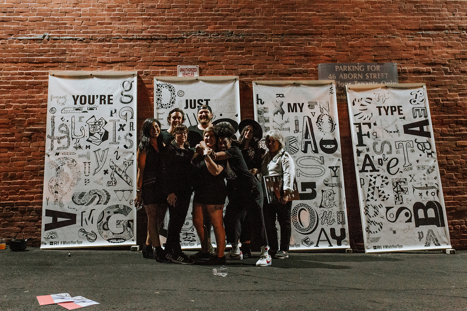
type by design
Every year AIGA Rhode Island throws a themed block party as its contribution to Design Week RI. It’s become an increasingly popular and anticipated event. This year’s theme was typography, celebrating the beloved medium that we designers work with every damn day.
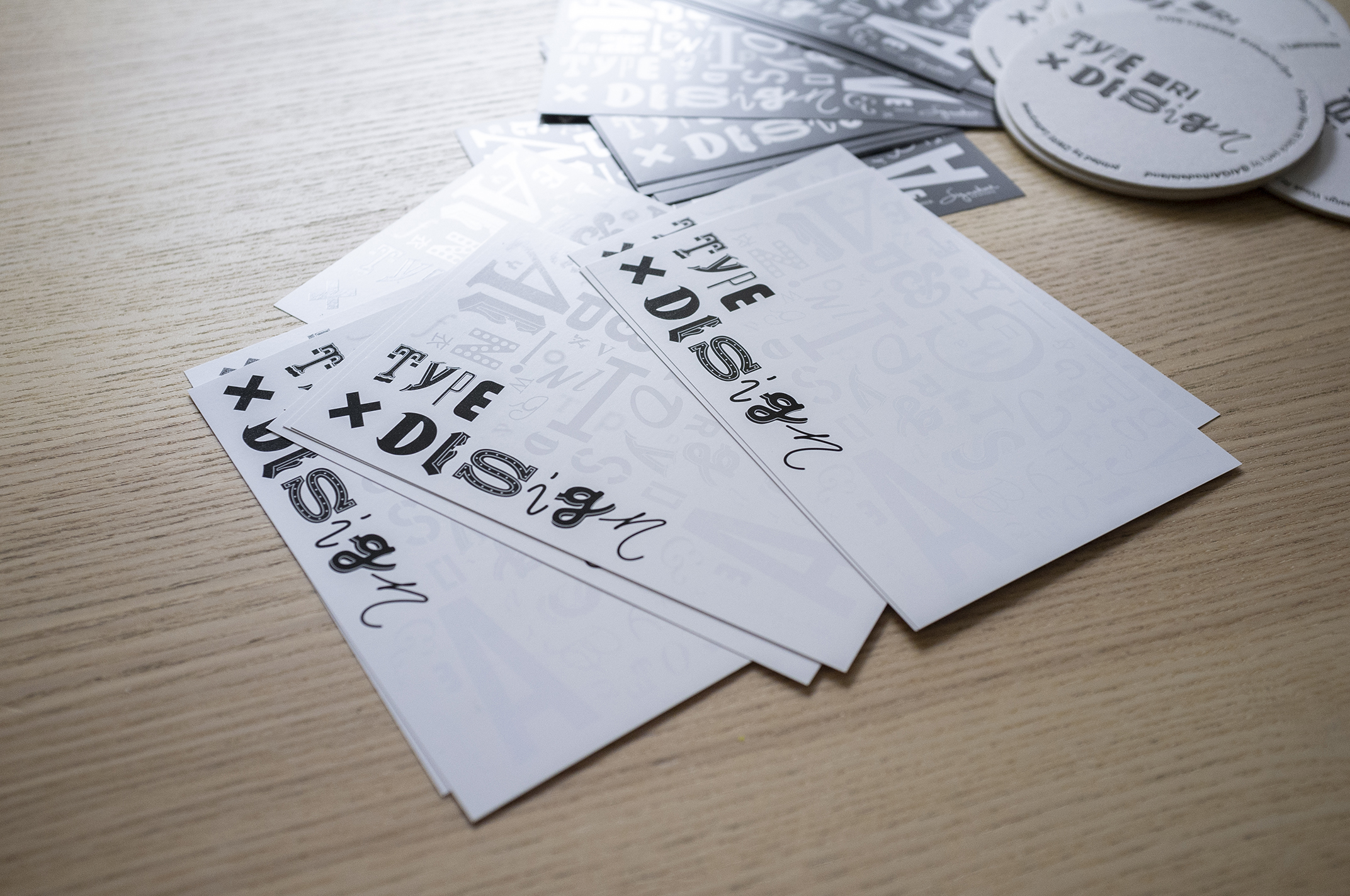
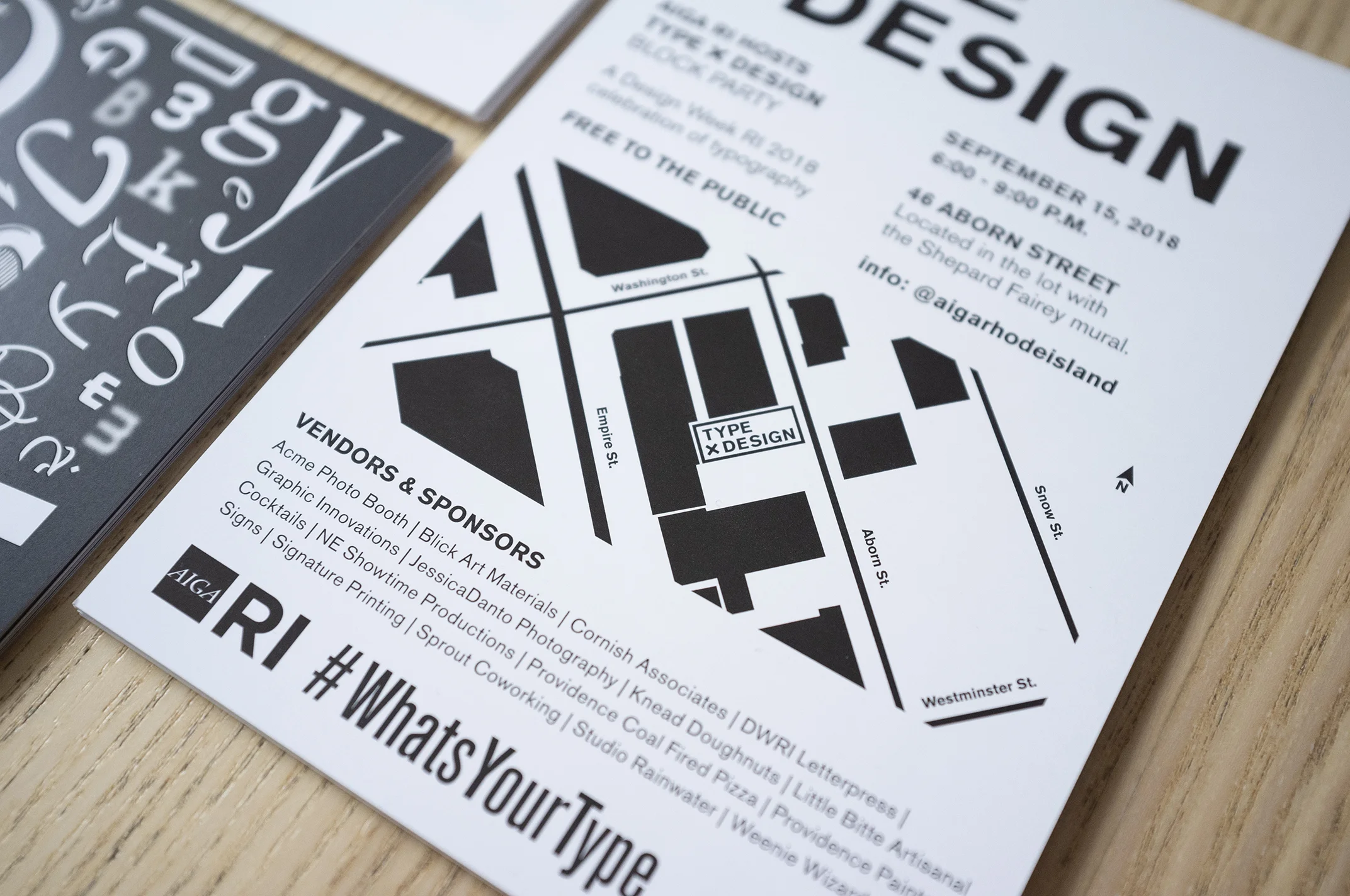
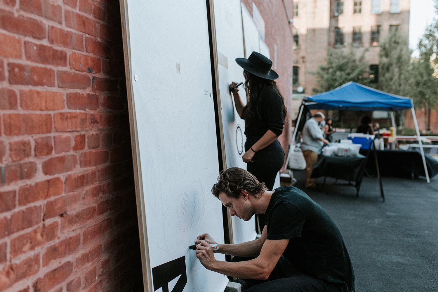
I was tasked with branding the event and all accompanying materials. I wanted to focus the identity on letterforms that are bespoke to Providence. Each letterform in the logotype was sourced from around the city. I had my eye out for shapes that were unique or interesting – an odd ‘S’ from a convenience store sign for example – not necessarily the most beautiful or correct. I chose a black and white motif to highlight and draw attention to the forms and details of the typography.
I then worked with the AIGA RI team to develop the marketing and social media campaign to promote the event which produced thousands of impressions and tons of engagement online.
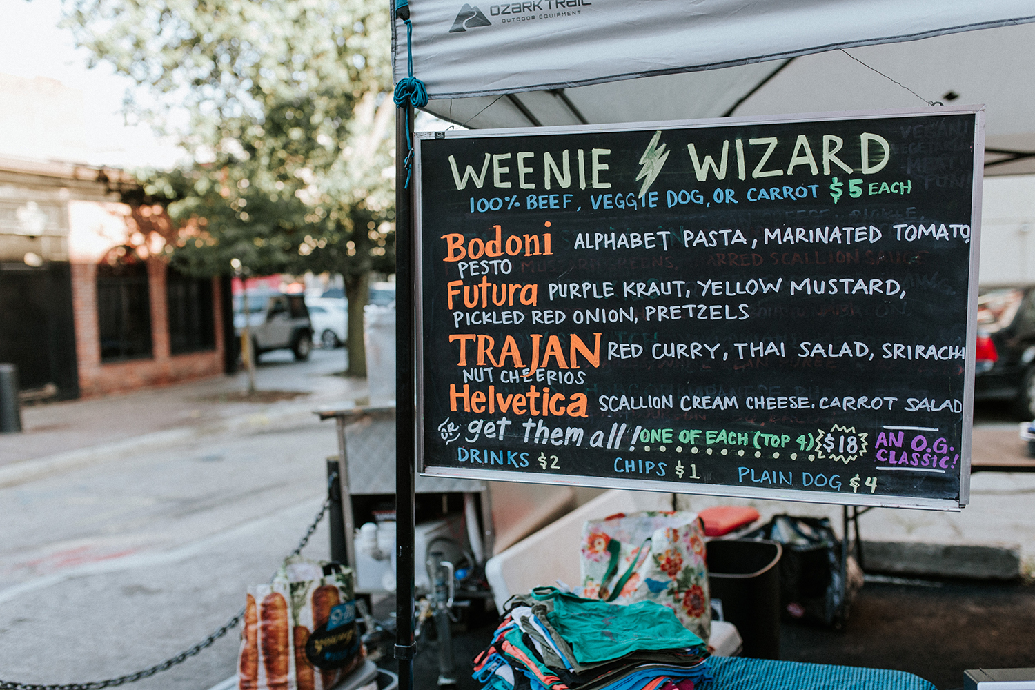
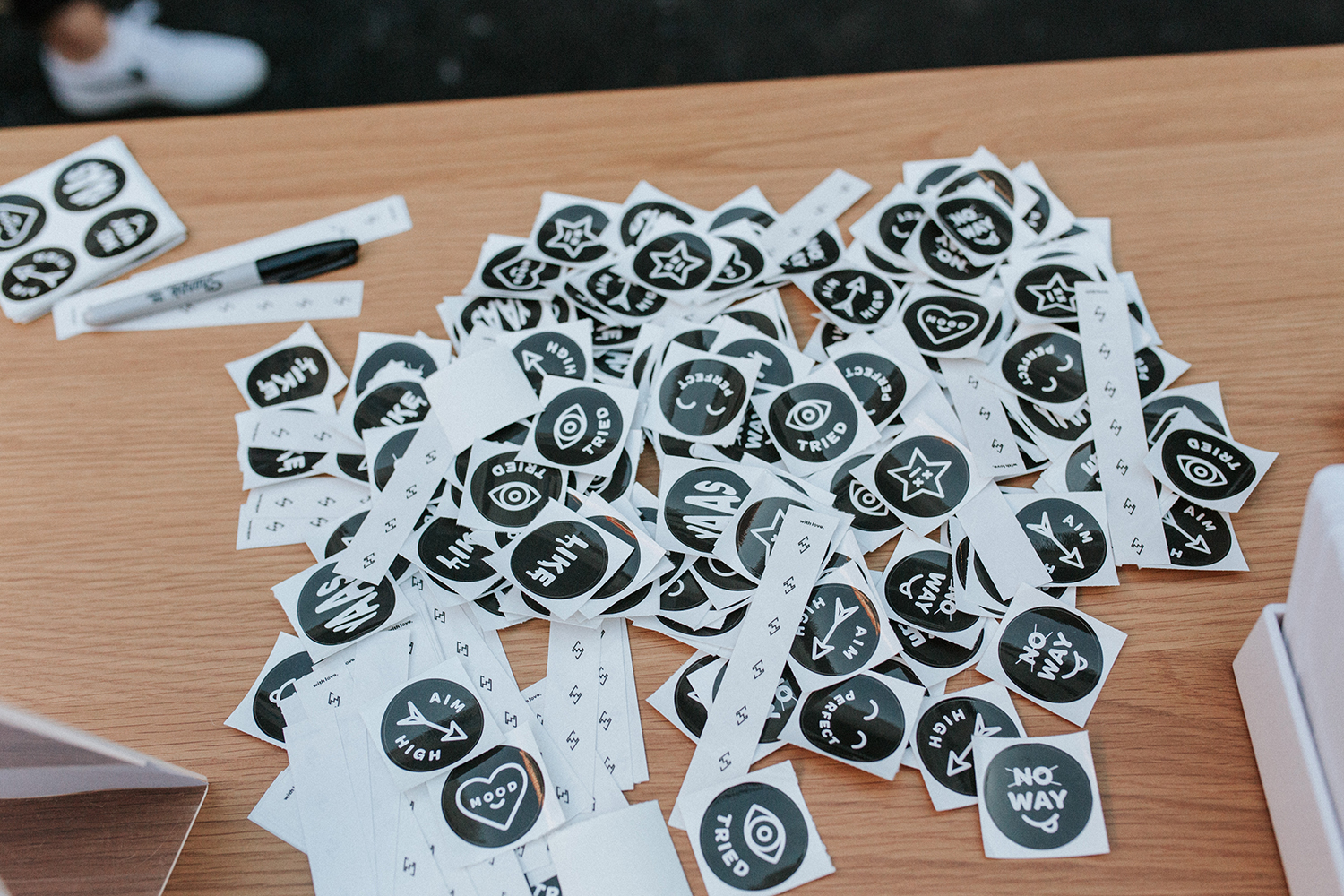
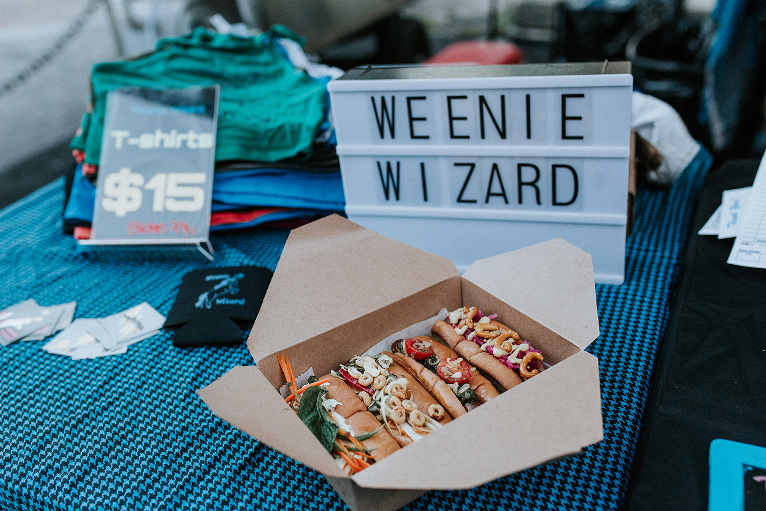
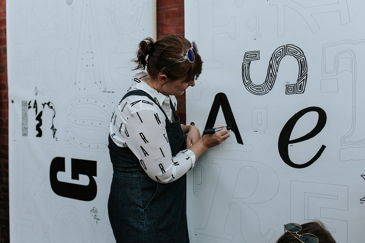
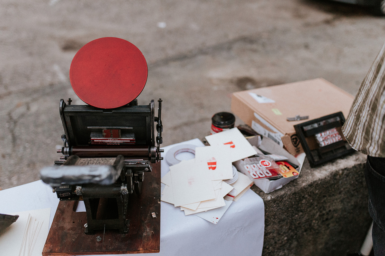
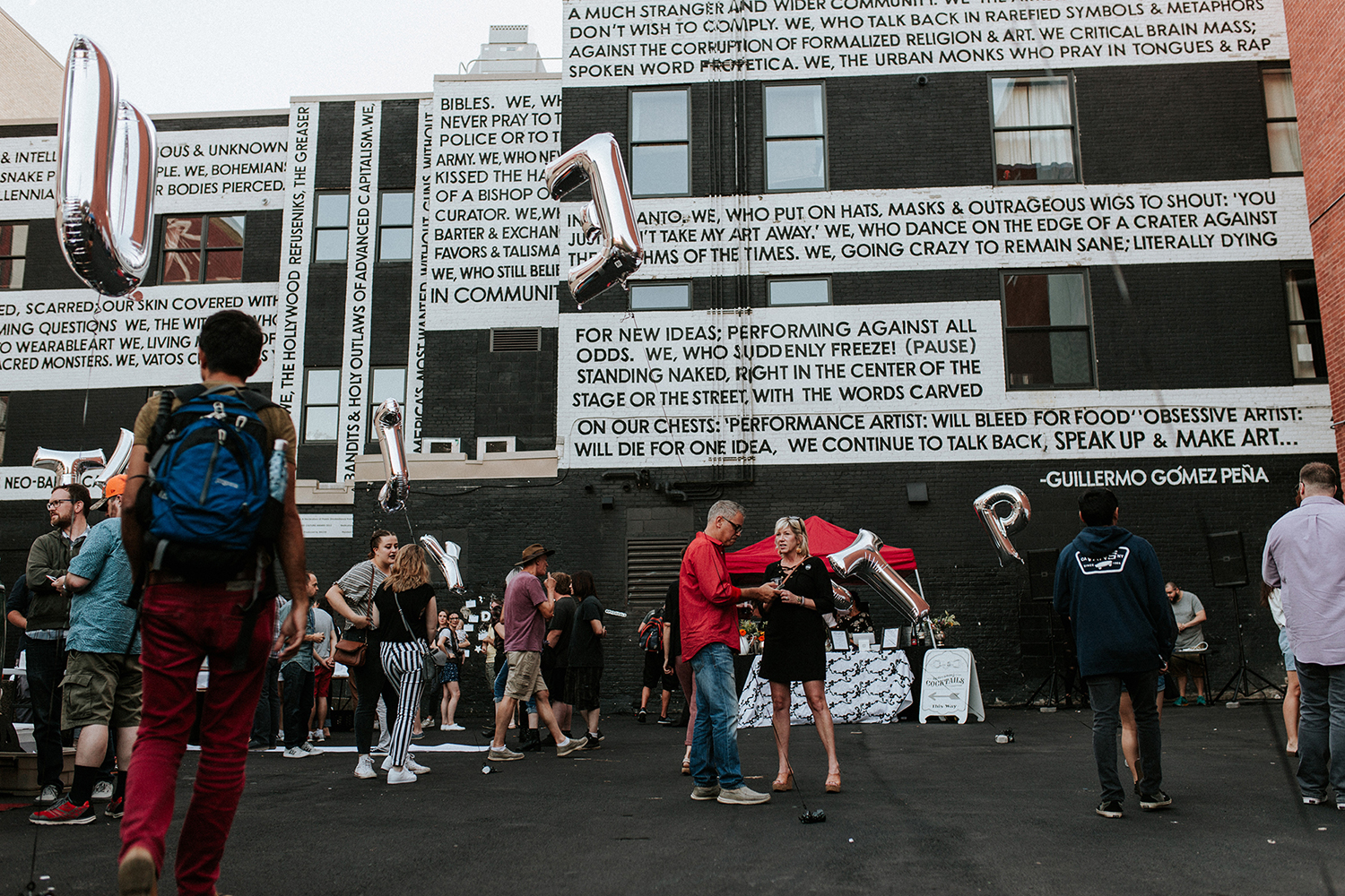
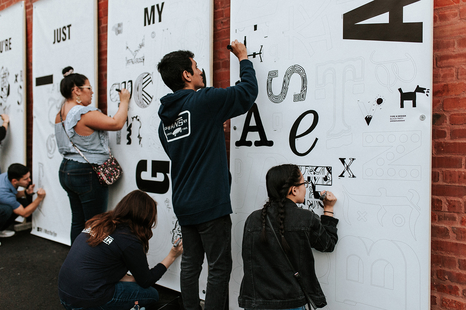
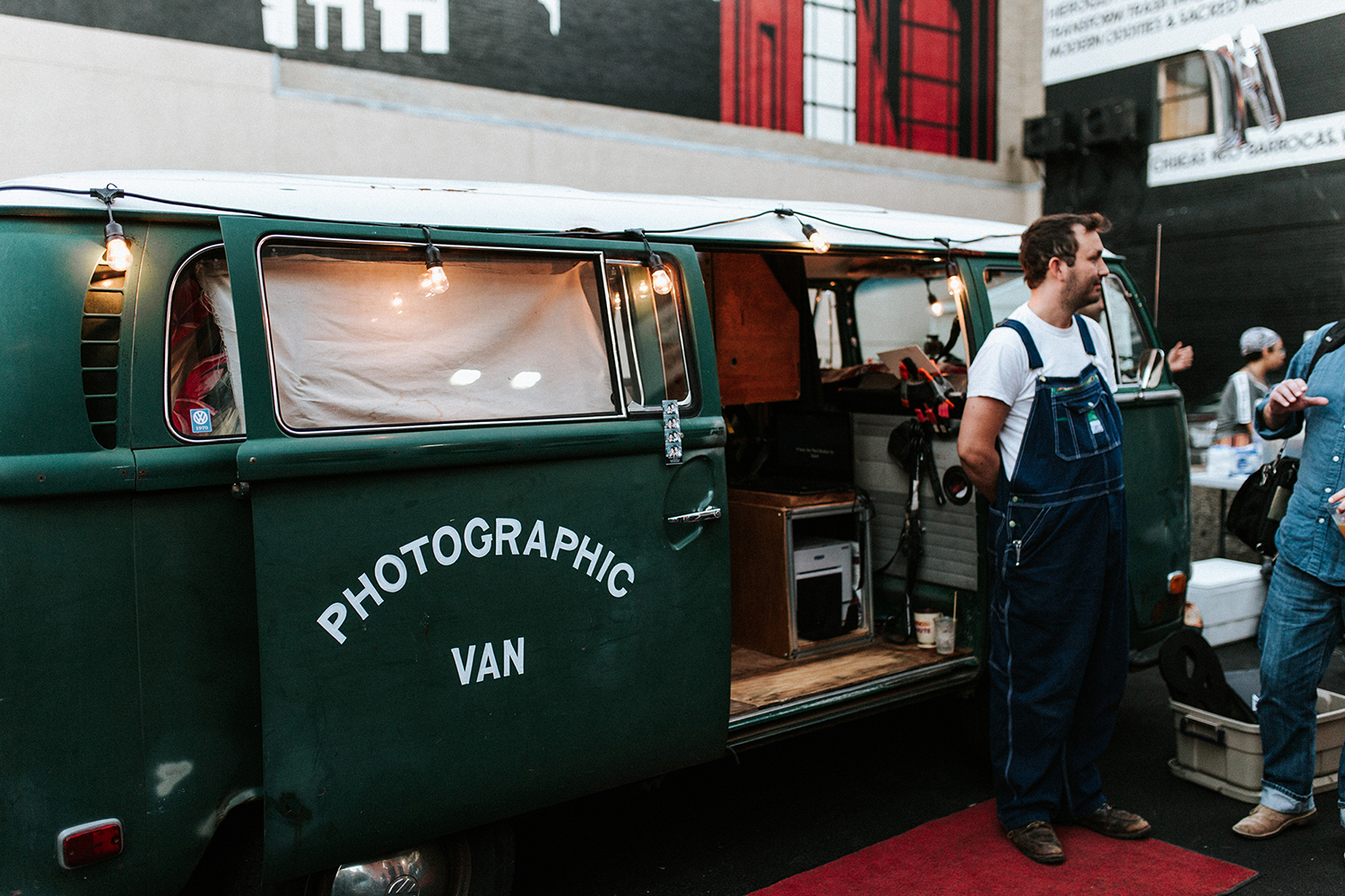
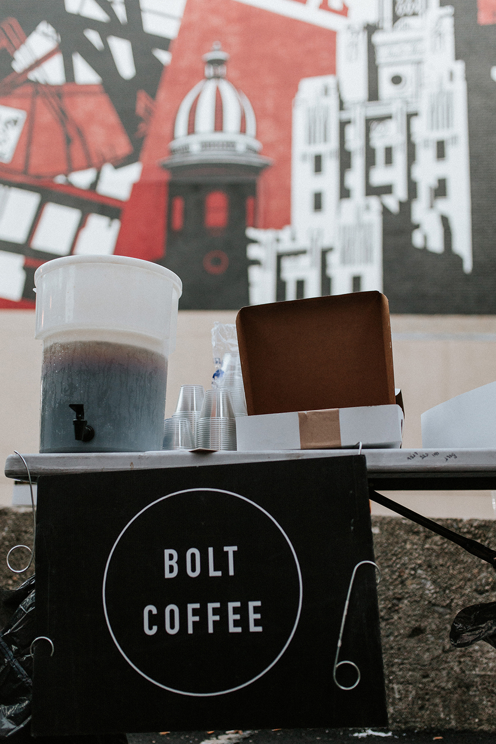
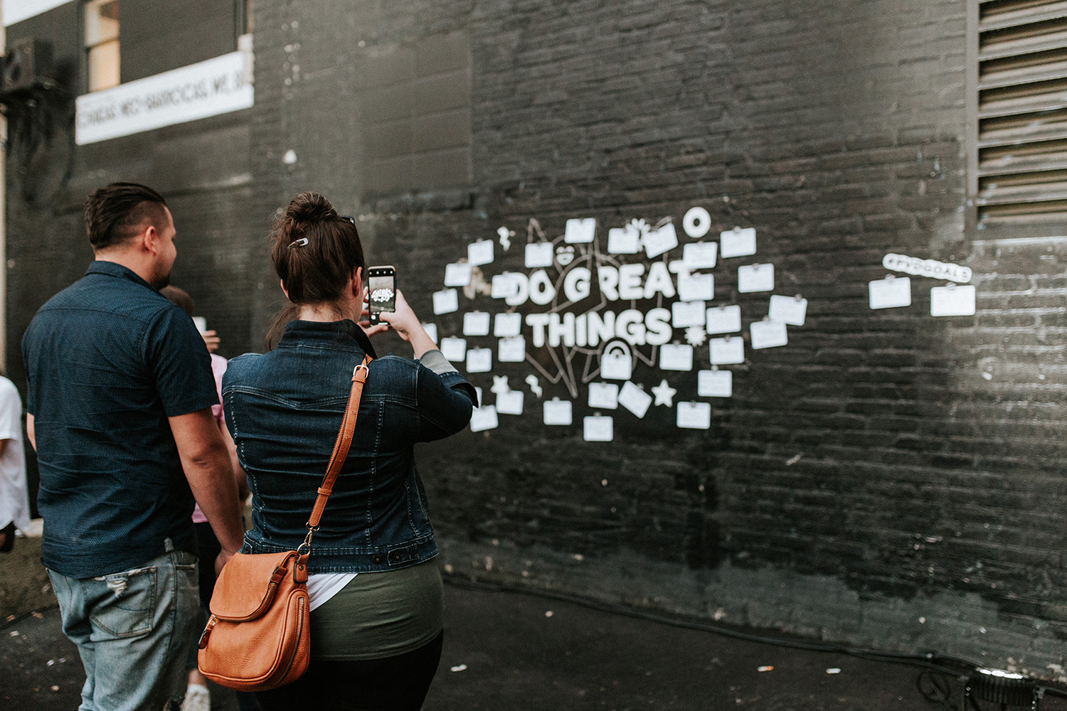
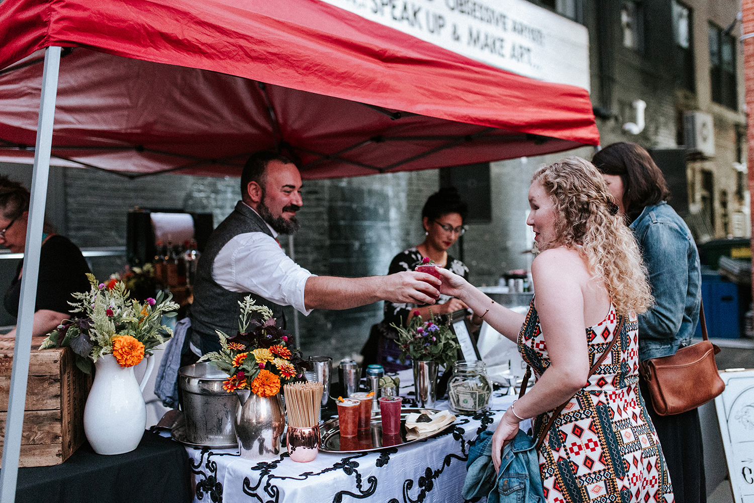
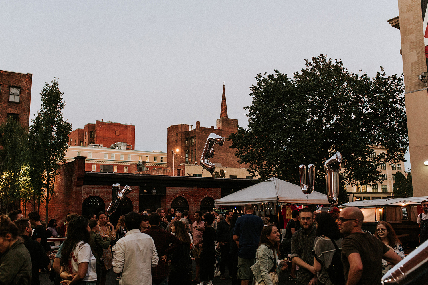
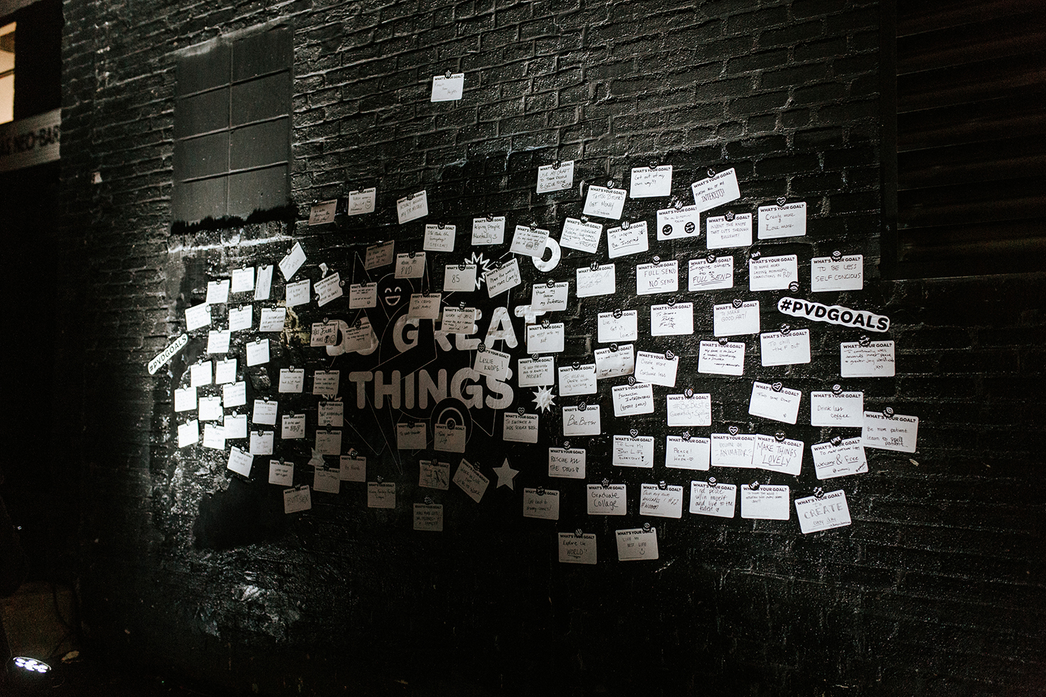
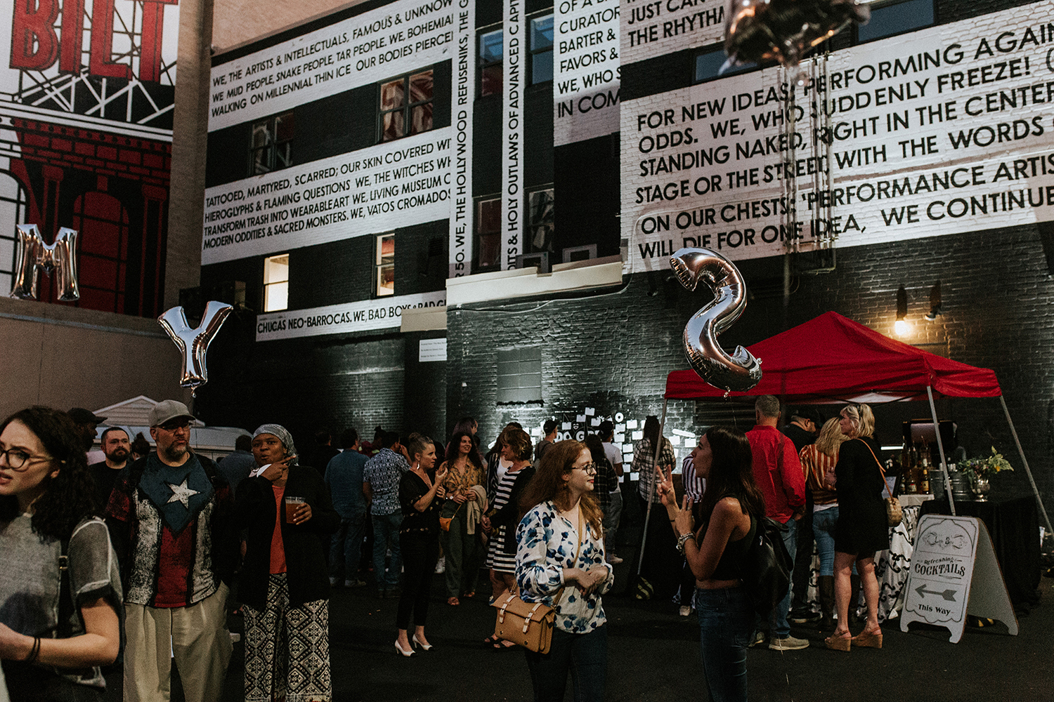
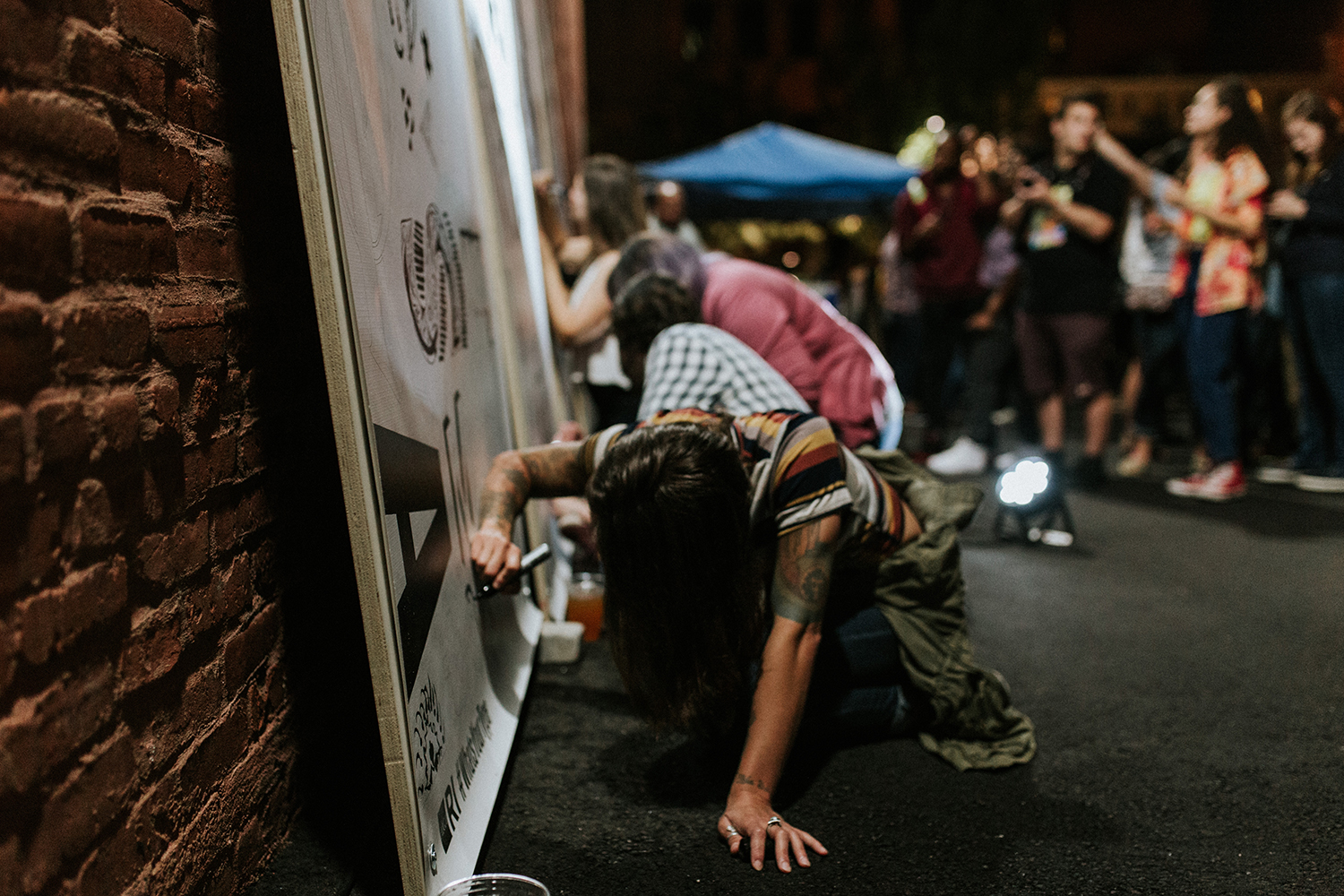
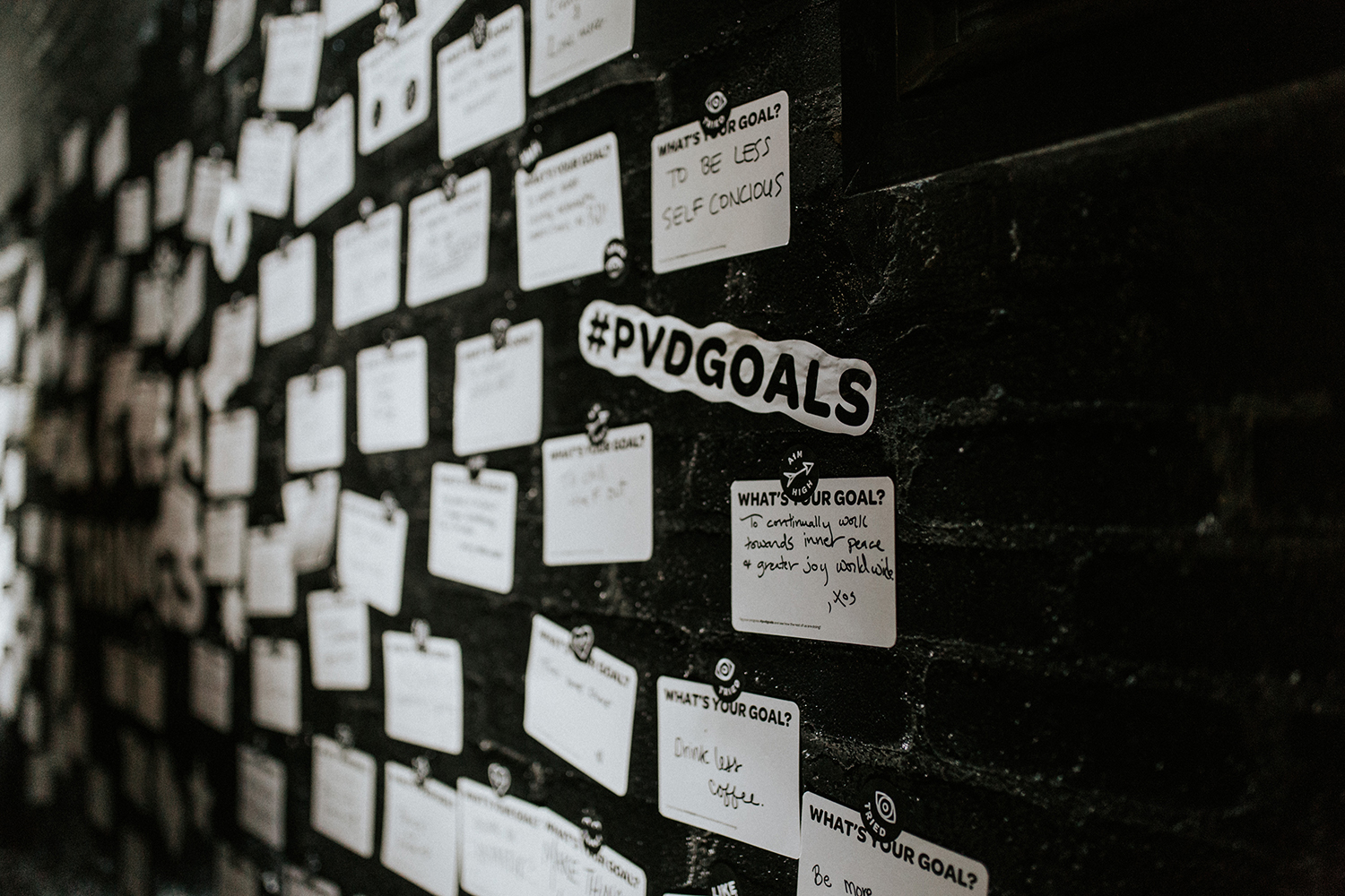
For the event itself we chose a location downtown beneath two murals – a text-based mural of a poem by Guillermo Gómez Peña, and a portrait of Providence by Shepard Fairey. We collaborated with Type Directors Club to offer two raffles and we had almost two dozen vendors and sponsors including a letterpress pop-up, a photobooth, food and beverages, a live DJ and two interactive installations. The final count showed that over 300 people came out to eat, drink, dance, print and art with us.
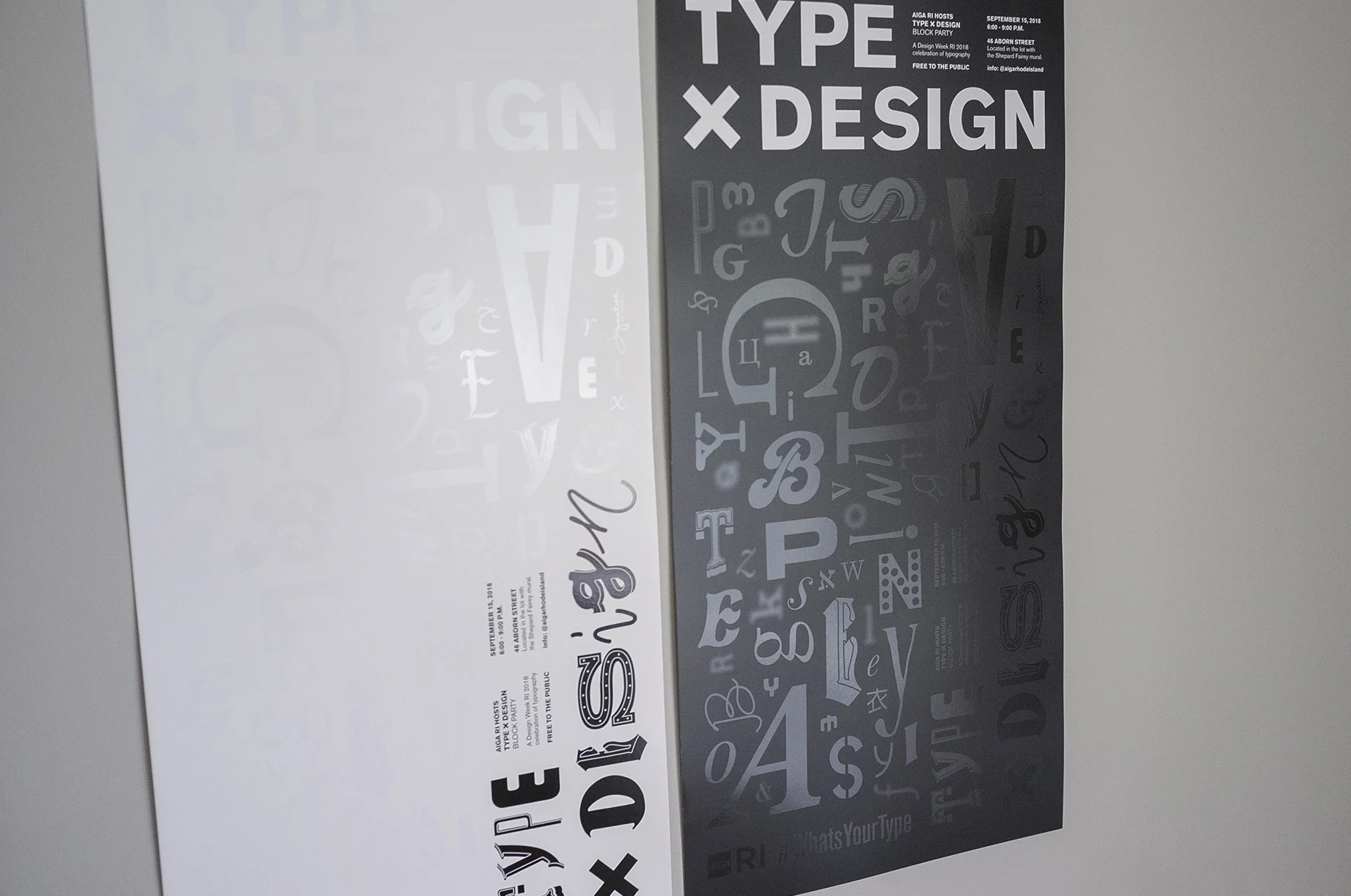
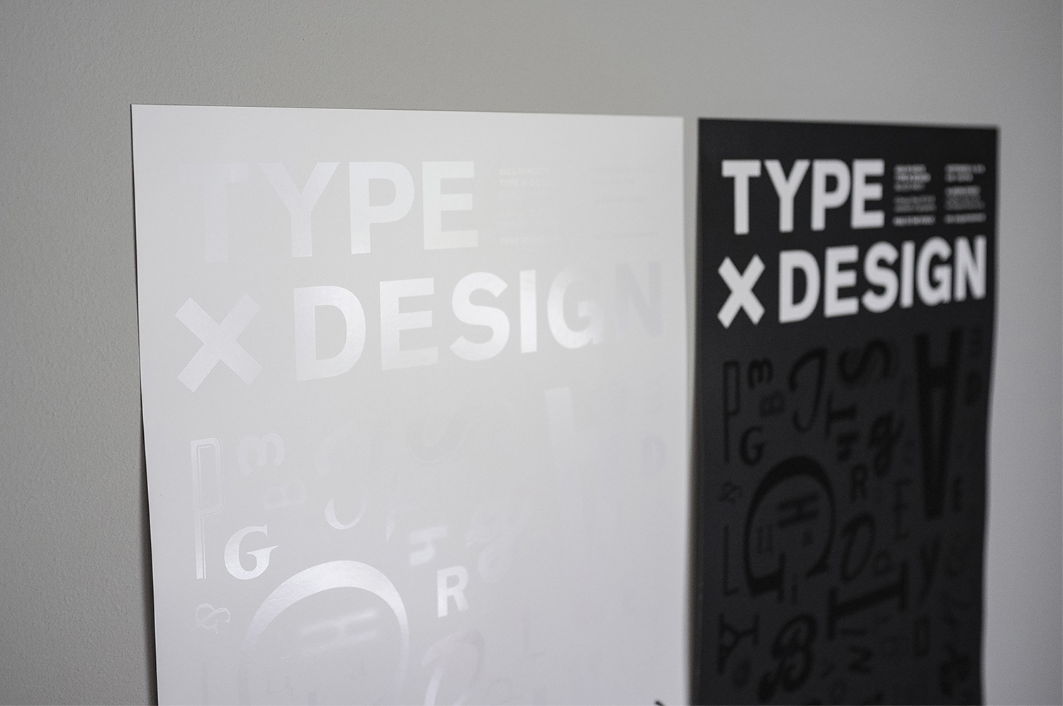

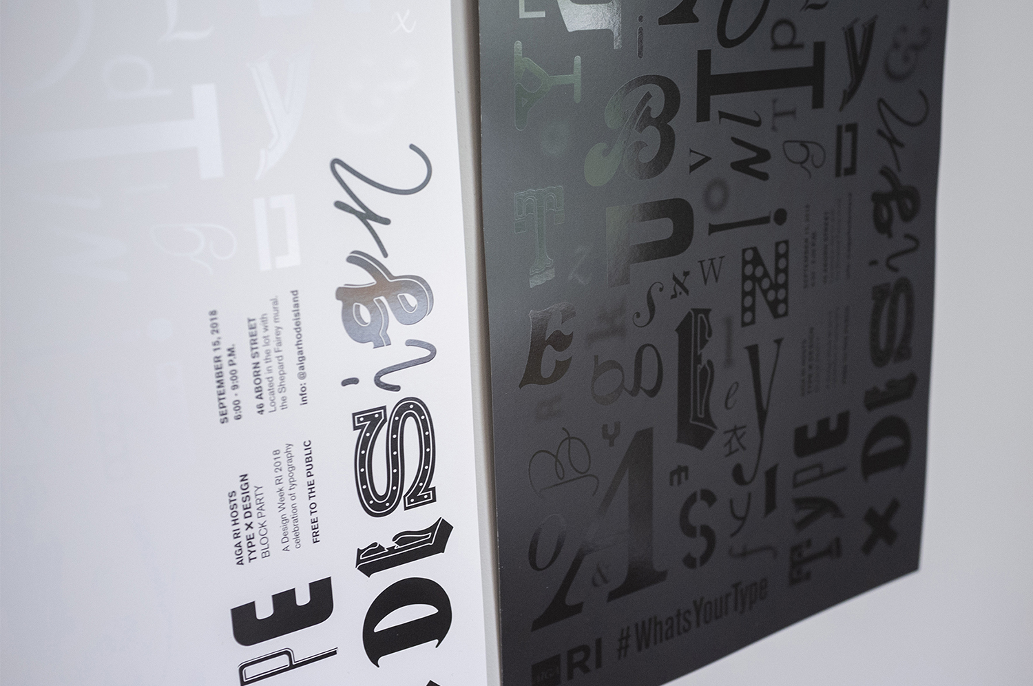


It was important to use letterforms that existed in the city. I wanted people to say ‘Hey, I’ve seen that before!’


I worked with Ally Thatcher and Jay Davani to build out a ballin’ social media campaign. Ally made that IG feed look real nice and came up with awesome animations to add an educational aspect to the project.


Weather was perfect, food was hot, drinks were cold, and the people were awesome.
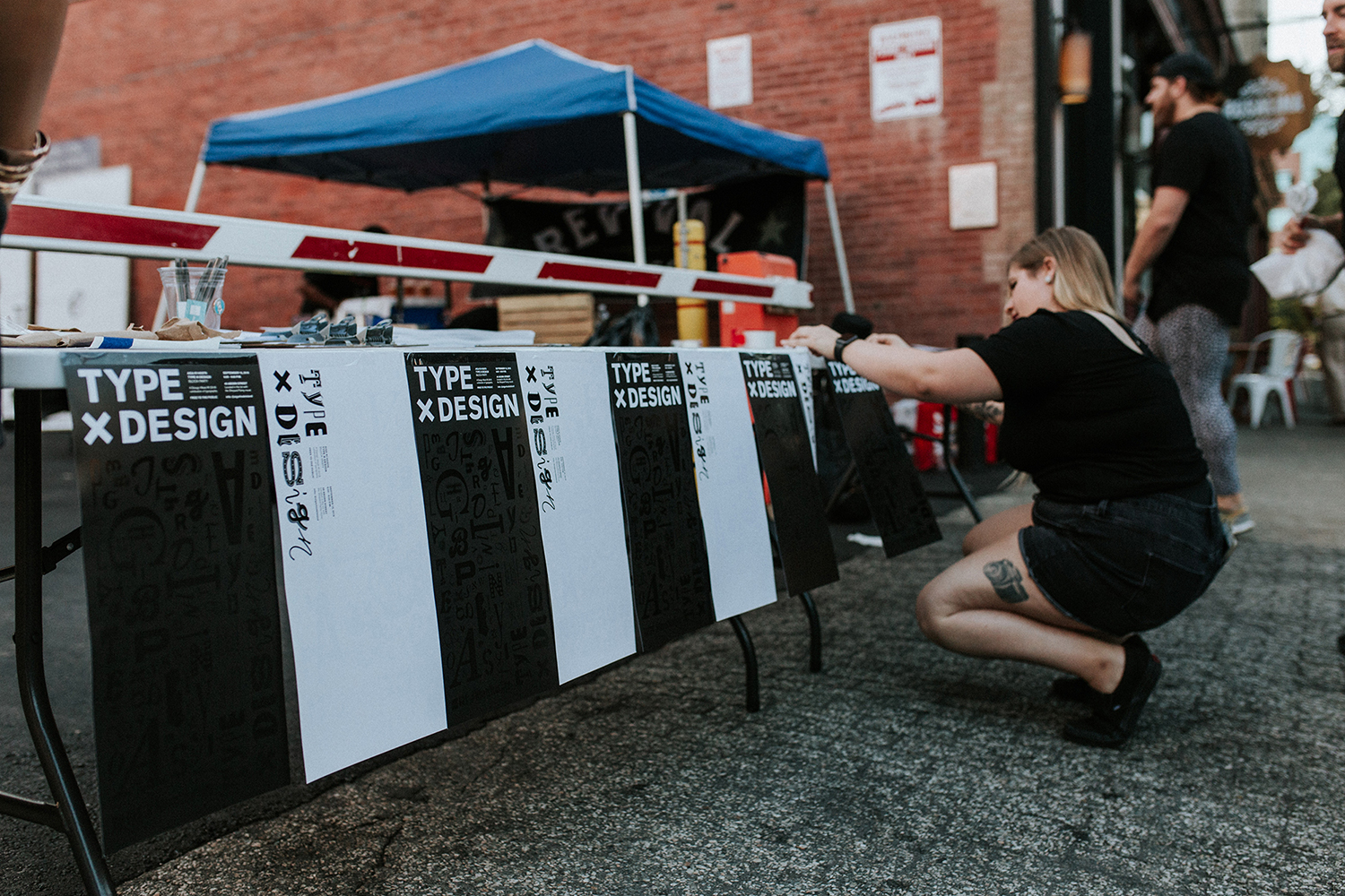
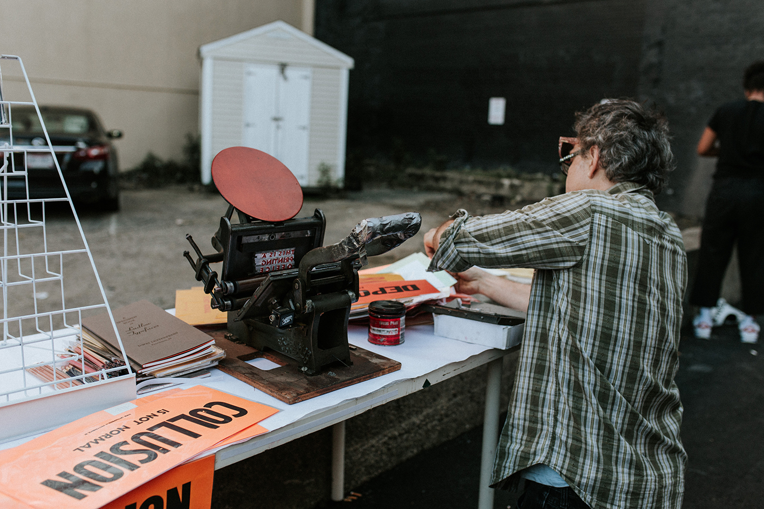
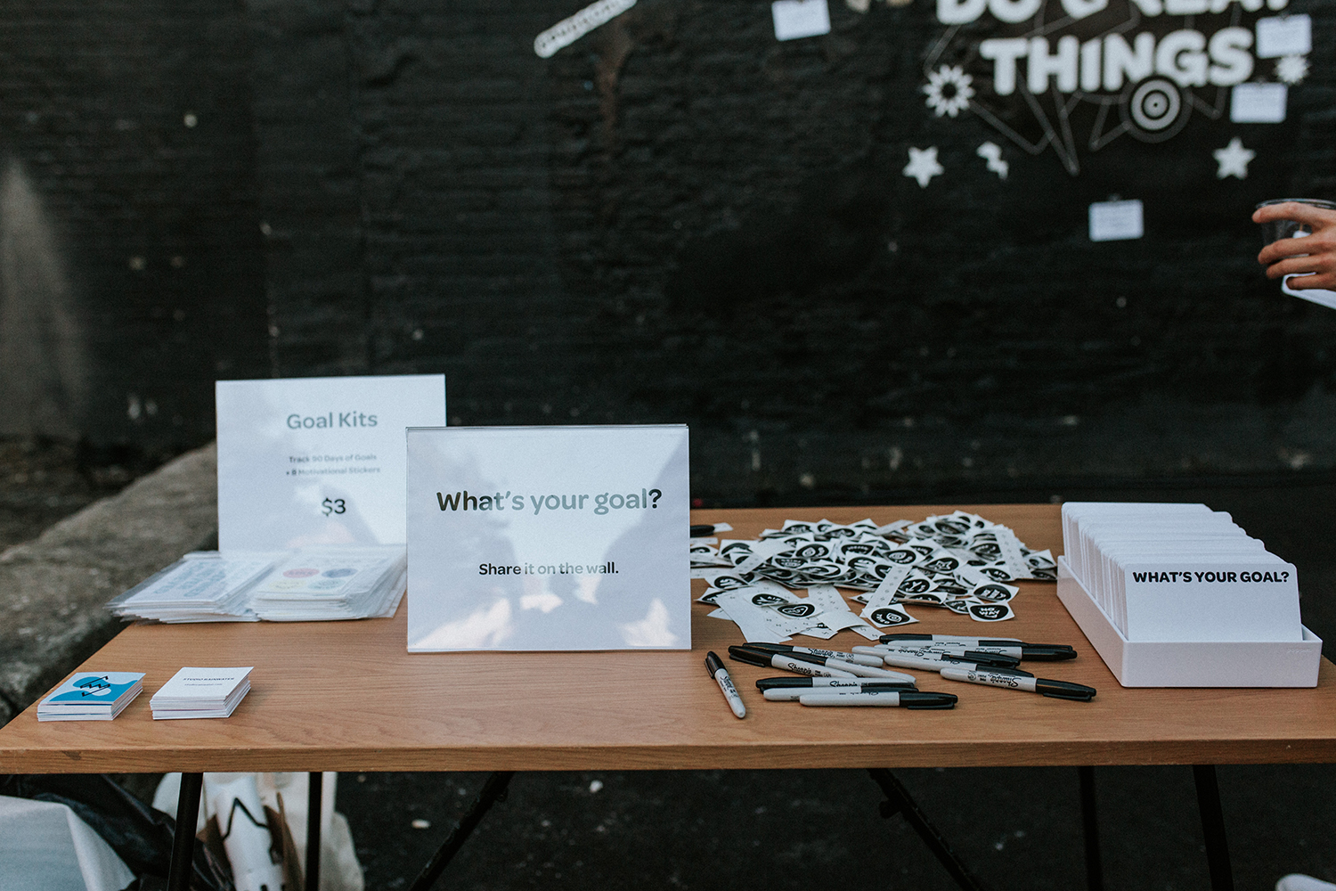
Event photos by JessicaDanto Photography